
Avoid Buyers Remorse when You Select Wall Paint!
Part 1 of a Series on Choosing Colors for Your Own Home
(Originally published June 2020; revised & improved from original!)
Is it just me, or is anyone else sick to death of their wall colors after spending so much time at home? If you’re nodding your head, it’s definitely time for you to make a change. Have you ventured into a paint store to look for ideas? So many options!
Where should you begin?

I will make the process of wall color selection much simpler by explaining the process that I use to narrow the many options for paint color. When you use a systematic method for selecting color, you are much more likely to choose a color that looks right for your room.
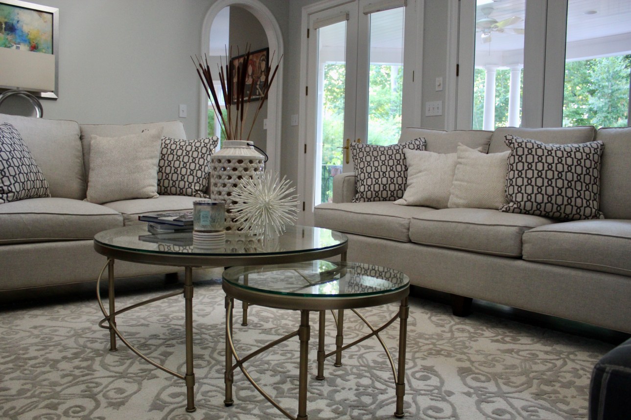
What else is going on in the room?
For those of you who don’t know me personally, I am a nurse who pursued home staging and decorating as a second career. I approach rooms systematically, like I approached my patients in the ICU. First step is always, assess the situation and the context. Ask yourself what about the room makes you dissatisfied. Is it too dark, bland, or outdated? Are you simply bored with the color? Identify what you don’t like, and try to pin down what you would do to change it.


Grant me the serenity to accept the things I cannot change…
Are you operating on an unlimited budget, where you have the luxury of changing everything that you want to? Congratulations, you’re one of the very few! As you can imagine, most of us don’t have that option, and even if we did, we may not want to take on a full remodel. If you aren’t planing to change the flooring, window treatments, or home furnishings, then you need to maneuver around those elements.
For example, I have hardwood flooring in the downstairs of my home. Refinishing them was not a feasible option, so I needed to make sure my floor undertones didn’t clash with my selected paint colors.
The same goes for tile flooring, as it is expensive to demolish, and expensive to replace. Unless you want to renovate, you may have to work around it. Furnishings like couches, chairs, and window coverings are easier to change, and it may be work the cost to replace problematic items.
After all, do you really want to decorate around an ugly couch that you don’t even like? If you settle, you will ultimately be unhappy with the finished room.


Color or neutral?
This decision will depend on your own personal style preference. Do you want an actual color on the walls, or are you inclined toward neutral (white, tan, gray)?
There isn’t anything wrong with either choice. However, I encourage you to really think it through. Even if you’re doing your own painting, choosing poorly will cost you more time and effort when you eventually have to re-paint the room again!
Using color cautiously
Keep in mind that if you use color, it will have an enormous visual impact, so select carefully. My daughter likes vivid tropical colors, so when she said she wanted a turquoise room, I talked her into the palest color on the color strip. The impact was still profound, because her room is large with a lot of natural light.


Whether you choose neutral or a color, the paint undertone should coordinate with the other elements of your room.
Must-dos: Consider the lighting & try a sample first!
Is your space well-lit or dim, shadowy or direct sunlight, small and cozy, or large and expansive? Believe me, it all makes a difference in how the color will look! With so many elements to consider, how can you know how will look? One thing you must do is to try on the color before you commit.
Purchase a sample of your paint, and create large paint samples on sample board. Then, paint the boards and tape them to several walls in the room. Live with them for at least 24 hours.
How does the color appear? Too light? Dark? Weird undertones? Be willing to admit to yourself if the color doesn’t work, and try again with another color.

Feeling brave? Try it on, for real!
As an alternative, you could paint a sample directly on the wall. I did exactly that in the man cave in my basement, which has a lot of shadows. Unfortunately, my husband was convinced that he wanted gray walls. Since he was insistent, he selected the paints that he liked, and I painted samples on each of the walls of the basement.
After a day of staring at the paint samples, I asked him which one he liked the best. After all of that trouble, can you believe that he told me he hated all of them! I agreed, none of them looked right. We finally selected a graysh-beige (greige), a good choice for the room.

…Or try it on virtually!
One other option is to go to the Benjamin Moore or Sherwin Williams websites and “paint” a virtual room with the color you want to try. Keep in mind that using that feature only gives you a simulated view of the paint color, and your computer screen might distort the color. I have, however, used this feature and find it helpful to have a visual image of a room painted in different colors.
Finally, what finish should I use?
For smooth interior walls, my favorite finish is eggshell. It cleans easily, barely has a sheen, and tends to be forgiving of wall blemishes. Unlike eggshell, flat paint often looks chalky in well-lit spaces, and satin is too much sheen for most rooms—it shows every roller and brush stroke. However, satin may be appropriate for humid rooms like bathrooms.

See my blog about which white to select (Which White is Right?), especially if you’re changing trim paint. It’s really easy to choose a white that clashes with your wall color, so use my tips to get a match that looks good. Generally, whites that tend to look good with most colors are High Reflective White (Sherwin-Williams) and Chantilly Lace (Benjamin Moore).
As always, take the time to test a sample against your new color before you begin painting! It will save you an enormous amount of time and money to get it right the first time, trust me!


