
Demystifying Paint: Which White is Right for You?
Part 2 of a Series on Paint Selection
(Originally published June 2020; revised and improved from original)
If you find paint color selection to be confusing or overwhelming, you are not alone! When you go into a paint store and see the all of all possible paint colors, how can you even know where to begin?

Several future blog posts will address color selection separately. After all, paint color selection is a confusing topic and definitely worthy of a deep dive.
Today, I’m going to address the less-exciting, yet very important, topic of choosing the right white trim paint. So, if you think all white paints are interchangeable, allow me to change your mind!
Why the right white paint matters
If you have ever chosen a white trim paint randomly, taken the paint home, and painted over your existing paint, you know what I’m talking about. Even worse, have you tried to touch up white trim paint, only to find that the whites didn’t match? I have! It’s discouraging to find that the “white” trim paint actually looks like pastel yellow where you touched up your baseboard!
Selecting a white trim paint is somewhat tricky, but if you follow a process for choosing your paint, you will get the end result that you want.
Demystifying the process
No matter how large or small your project, always assess your space first. Are there furnishings or surfaces that you are not going to change? If so, identify all furnishings, such as couches, tables, or rugs that will stay in the space. You will also need to make a note of surfaces such as flooring, window coverings, or tile that will remain unchanged. If you are repainting the walls, select the wall color before selecting your white trim.
After you have defined the “permanent” elements of the space, determine the dominant undertone. Simply put, the undertone is either going to be cool or warm. In the ambient light of the space, take a white sheet of printer paper and place it against the elements of the room.

Warm elements have dominant undertones or beige or yellow, whereas cool elements have dominant undertones of blue or gray. Similarly, secondary colors such as green or purple will tend toward either cool or warm, since those colors mix a warm and a cool primary color in different proportions.
Determine the dominant undertones
When you look carefully at the elements in your space against plain white paper, the dominant undertone should emerge. If you’re still not sure, compare your room elements against a paint sample of yellow-beige and against a sample of gray. You will see that one will look better than the other, and one will likely clash.
A sense of harmony in your space
If you identify clashing undertones between the different elements of your room, you will need to make them all “agree”, or the room will always seem wrong. Unfortunately, this may mean re-painting, re-upholstering, or replacing items. If you’re serious about wanting a cohesive look, trust me on this point. Unless you want a mismatched room, you must change elements that don’t work together.


Narrow the options for trim paint
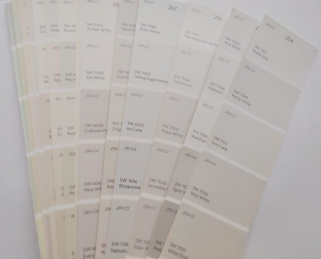
Finding the dominant undertone for your room should guide your trim color selection. Paint companies produce sample paint chips that you can obtain at no cost through paint dealers.
Find the whites that have the correct undertone. Next, decide if you want a light white or a trim color with a deeper saturation, like a cream. Narrow your selection by comparing the paint chips to the existing surfaces in your space. Obviously, the trim should complement the wall color of the space!

Test the paint before committing
Absolutely don’t skip this step!
Make sure to look at the wall and potential trim colors in the lighting of the actual room—shadows and lighting dramatically change how paint appears. Compare your wall color against several different white trim colors in the correct undertone. This should help you to narrow your search and find the right white for your space.
Cream, off-white & white
To be clear, beige or “cream” looks best against warm colors. “Off-white”, or a white with a slightly muted, cool undertone, looks best against cool colors. Pure white without undertones looks best against cream, pastel, or white-colored walls.

If your space contains bright or vivid colors, your best trim option will be a pure white.
Don’t make the mistake of choosing the paint based on the name of the paint!!! “Pure white” or “Ultra white” looks different between manufacturers! Take the time to get a small sample of paint and test it on a paint board. It is worth the trouble to test the white before you start painting trim!
When in doubt, consult a professional

If you’re still in doubt after trying samples on a paint board, ask a paint professional. This step will save you the cost of paint if you buy the wrong white, and it will save you time if you don’t have to re-paint over a mistake. I have made these same mistakes in the past, and remember the feeling of dread when I had to repaint. Following this method of choosing white trim paint will save you from making an expensive mistake!
Interested in learning how to choose the right paint color? See my first installation in the paint color series, “Avoid Buyers Remorse when you Select Wall Paint!”


